View Digital Experience Monitoring Dashboards
![]() For supported software information, click here.
For supported software information, click here.
You can enable digital experience monitoring (DEM) on Versa SASE client devices to periodically monitor end-to-end network and application performance for the devices. When DEM is enabled on a device, Versa SASE clients collect the following metrics for a user device:
- Device memory, CPU, disk utilization, and battery life
- WiFi signal strength, and transmit and receive bandwidth per SSID
- Local network segment metrics such as delay, jitter, and packet loss
- Internet segment metrics such as delay, jitter, and loss, both end to end and for each hop level
- Application metrics such as DNS lookup time, TCP and SSL connect times, HTTP latency, time to first and last byte, delay, jitter, and packet loss to application server.
The SASE client exports these metrics to a Versa Analytics cluster, which uses them to derive an experience rank, known as the DEM rank, that ranges from 1 through 100. A value of 1 represents the best experience and 100 represents the worst experience. Versa Analytics DEM maps, charts, and tables provide in-depth information about the experience at the organization, gateway, device, and application levels.
Secure Access Digital Experience Dashboard
The DEM dashboard displays information about the end-to-end network and application experience for each user device in an organization.
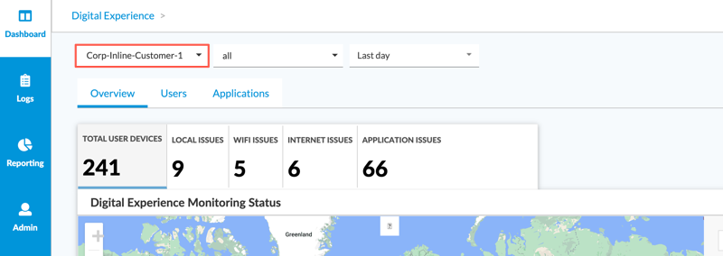
To view the DEM dashboard, select Analytics > Dashboard > Secure Access > Digital Experience, and then in the first horizontal drop-down menu select an organization.
The DEM dashboard displays the following tabs in the horizontal menu bar:
- Overview
- Users
- Applications
Overview Tab
Select the Overview tab to display DEM status for an organization's users. This screen displays five subtabs. The first subtab, Active User Devices, displays a map for all users. The remaining subtabs display a version of the map that includes only users with potentially suboptimal experiences in the following categories:
- Local Issues
- WiFI Issues
- Internet Issues
- Application Issues
A table summarizing user experience by country displays to the right of the map.

To zoom in on a country you can:
- Click the circle icon displayed for the country on the map.
- Click the country name in the table to the right of the map.

To zoom in on a city, click the city name in the table to the right of the map. The users located in the city display in the table to the right of the map.

To view detailed information for a specific user, select the username in the table. The screen displays the User Information and User Applications tabs for the user. For more information, see User Information Tab and User Applications Tab, below.
Users Tab
To display DEM data by user, select Analytics > Dashboard > Secure Access > Digital Experience > Users. The User Experience Metrics table displays. The table includes user information for the organization and time period shown in the first and third drop-down menus at the top of the main pane.
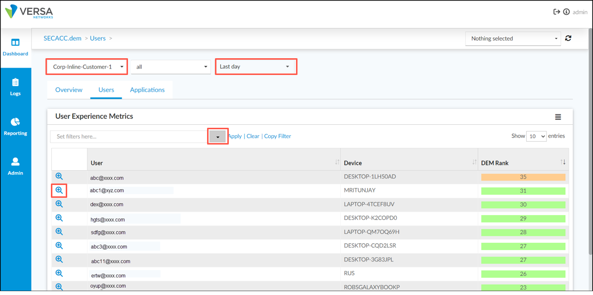
To search for a specific user, click the down arrow to the right of the Set Filters field, and then click Add/Edit Filter to display the Filter popup window. Enter a search pattern, and then click OK. You can use the asterisk * as a wildcard in the search pattern.
To display a detailed view of a user's experience, select the ![]() Zoom icon in the row that contains the user. The screen displays the following tabs:
Zoom icon in the row that contains the user. The screen displays the following tabs:
- User Information—Displays device information and statistics indicating experience across the network at various segments over time for the user's device.
- User Applications—Displays application performance experience for the user's applications.

User Information Tab
To display device information and statistics indicating experience across the network at various segments over time for the user's device, in the User's Experience Metrics table, select the ![]() Zoom icon in the row that contains the user, and then select the User Information tab.
Zoom icon in the row that contains the user, and then select the User Information tab.
The User Information tab displays the following charts and tables:
- User's Most Recent Information—Experience rank, number of monitored apps, and user information. If the Experience Rank is degraded or poor, you can hover over Experience Rank to display actionable insights.

- Experience Across Networks
- User Experience Over Time—Performance of user’s device over time. If the rank value is in the degraded or poor range, it is likely that the user’s device experienced local or network issues.
- WiFi Experience Over Time—Signal strength per WiFi SSID over time. A signal quality value of 0 through 33 is considered poor, 34 through 66 is degraded, and 67 through 100 is good.
- Traceroute to Gateway—Last known traceroute to the SASE gateway, and the reachability to the gateway through various hops.
- Local Network Latency Over Time—Local network latency and jitter metrics over time. Use this information to help determine whether there are issues connecting to the next-hop gateway.
- Local Network Loss Over Time—Local network loss metrics over time.
- Internet Delay Over Time—Internet delay and jitter metrics over time. Use this information to help determine whether there are network issues in the internet segment connecting to the SASE gateway.
- Internet Loss Over Time—Internet loss metrics over time.
- CPU Utilization—Device CPU status over time.
- Memory Utilization—Device memory utilization over time.
- Battery Status—Device battery status over time.
- Disk Utilization—Device disk utilization over time.

User Applications Tab
To displays application performance experience for the user's applications, in the User's Experience Metrics table, select the ![]() Zoom icon in the row that contains the user, and then select the User's Applications tab. The Application Experience Metrics table displays.
Zoom icon in the row that contains the user, and then select the User's Applications tab. The Application Experience Metrics table displays.

Select the ![]() Zoom icon to the left of a row to display application details for the user, device, and application listed in the row.
Zoom icon to the left of a row to display application details for the user, device, and application listed in the row.
The screen displays the following charts:
- Application Experience Across Network Segment—Last reported performance at different points in the network.
- Traceroute to Application Server—Traceroute from the user device to the application server. In Releases 22.1.4 and later, traceroute information includes the ISP and ISP location. This helps track the path traffic takes from the source to the destination.
- Application Rank—User device’s application performance over time for a specific application. In Releases 22.1.4 and later, when there is no data, charts display an inactivity bar in the x-axis.
- Application Network Statistics—User device’s application network performance metrics for delay, jitter and loss, over time for a specific application.
- Application Traceroute—Last known traceroute results for an application server through various network hops. For Releases 22.1.4 and later, the Traceroute chart includes the ISP and ISP location. The traceroute to the gateway and application server has the public IP address of each hop that responds. From the public IP address, we derive the ISP and location of the hop. This helps track the path traffic took from the source to the destination.
- DNS Lookup Time—Time taken to perform DNS operations over time for a specific application.
- TCP Connect Time—Time taken to establish TCP connectivity over time for a specific application.
- SSL Connect Time—Time taken to perform SSL handshake over time for a specific application.
- HTTP Latency—Time taken to perform HTTP operations over time for a specific application.
- Data Transfer Time—Time taken to transfer data from the client to the server over time for a specific application.
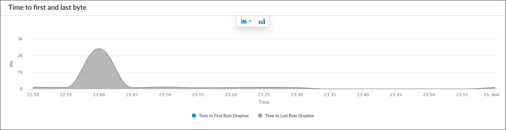
- Time to First and Last Byte—Time time taken to transfer first and last byte over time for a specific application.


![]()
.png?revision=1)


Applications Tab
To view a list of applications and overall application performance for an organization, select Analytics > Dashboard > Secure Access > Digital Experience, and then select the Applications tab to display the Application User Experience Metrics table. The table includes application information and application rank for the organization.

To search for a specific application, click the down arrow to the right of the Set Filters field, and then click Add/Edit Filter to display the Filter popup window. Enter a search pattern, then click OK. You can use the asterisk * as a wildcard in the search pattern.
To view a map of the application server locations for an application, click an application name in the table.

To display application performance details for the user, device, and application listed in a row, select the ![]() Zoom icon to the left of the row. For more information, see User Applications Tab, above.
Zoom icon to the left of the row. For more information, see User Applications Tab, above.
To display user application experience for an application server, zoom in on an application server one or more times, until yellow or green ![]() User icons are displayed for the users connected to the application server. In Releases 22.1.4 and later, a color-coded legend in the upper right-hand corner of the map displays the application experience quality for the users connected to the server.
User icons are displayed for the users connected to the application server. In Releases 22.1.4 and later, a color-coded legend in the upper right-hand corner of the map displays the application experience quality for the users connected to the server.

(For Releases 22.1.4 and later.) To view a map of the gateways for the selected application, select Gateway from the drop-down menu in the upper right-hand corner of the map.

(For Releases 22.1.4 and later) To display user application experience for a gateway, zoom in on the gateway one or more times, until yellow or green ![]() User icons are displayed for the users connected to the gateway. A color-coded legend in the upper right-hand corner of the map displays the application experience quality for the users connected to the gateway.
User icons are displayed for the users connected to the gateway. A color-coded legend in the upper right-hand corner of the map displays the application experience quality for the users connected to the gateway.

Supported Software Information
Releases 22.1.3 and later support all content described in this article, except:
- Release 22.1.4 adds support for application gateway maps. The Traceroute chart includes the ISP and ISP location